


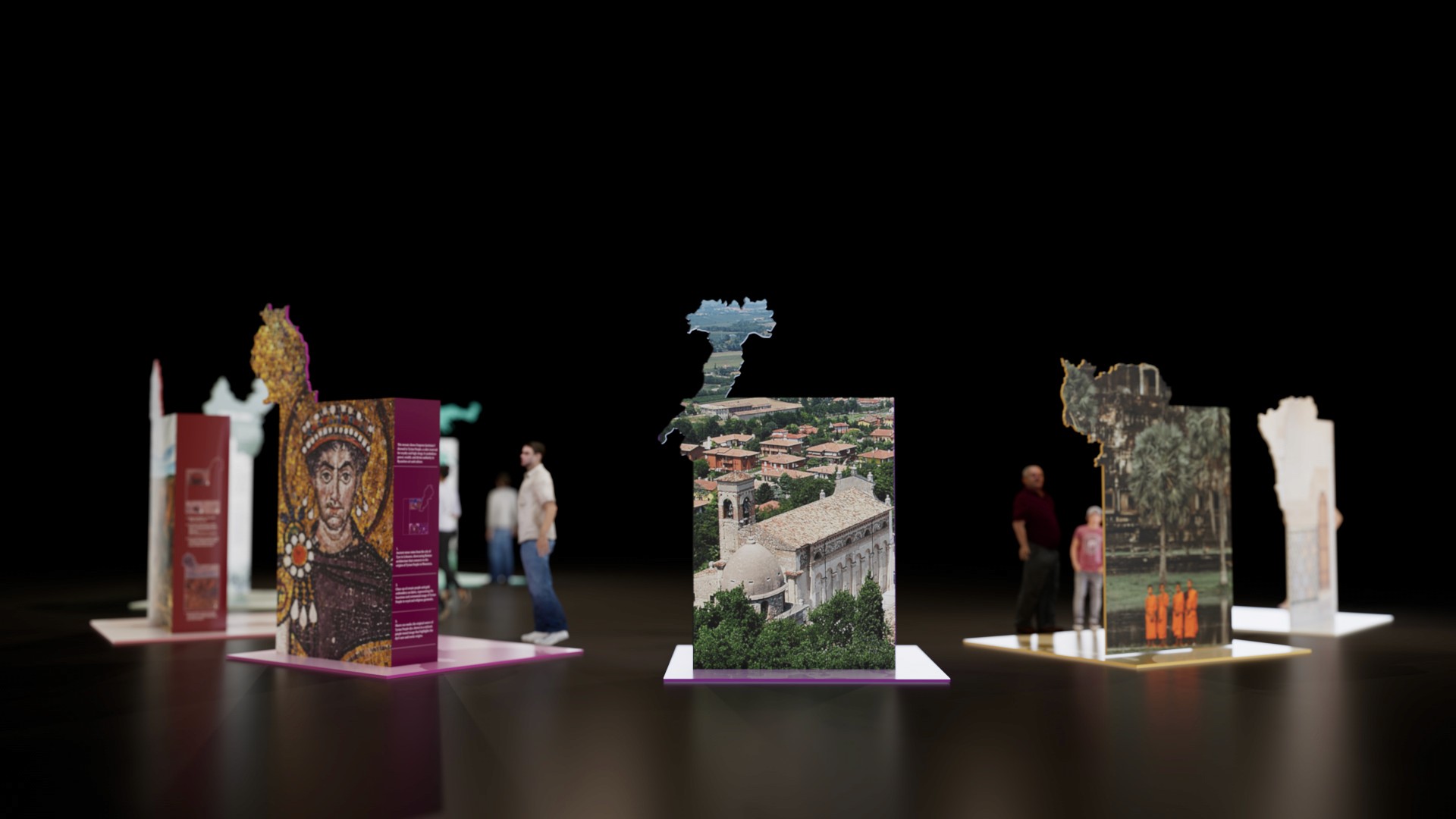


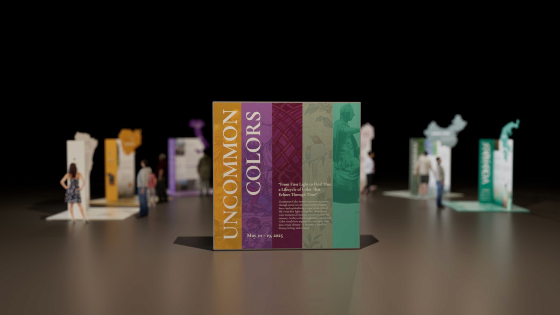

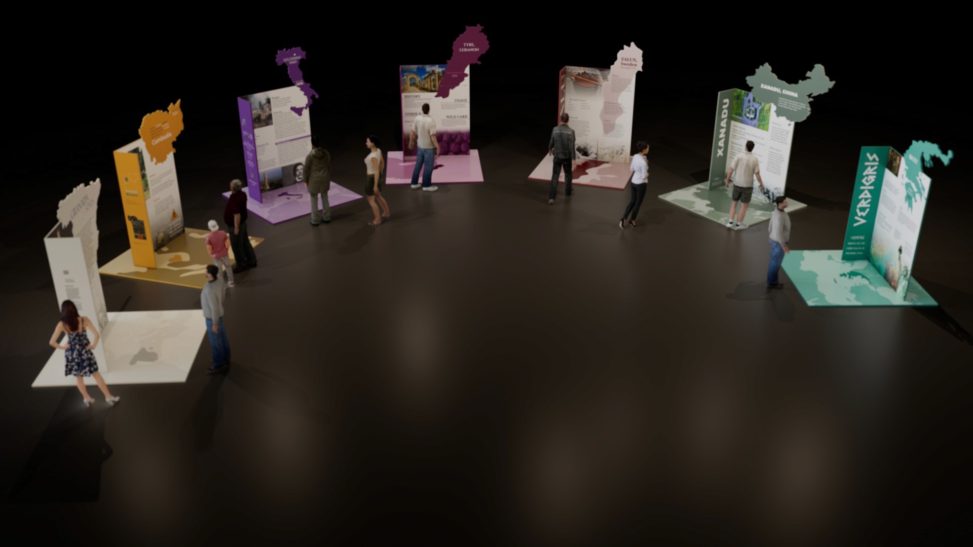
Uncommon Colors started as a seven-person team project: a modular traveling exhibition built around seven rarely-named pigments — Isabelline, Gamboge, Solferino, Verdigris, Xanadu, Falu, and Tyrian. Four weeks later, working solo, I picked the same color system back up and extended it into a full museum exhibition graphic system — the banners, entrance walls, and intro panels needed to carry it from a set of individual color panels into a real, walkable gallery experience.
The team's brief was to design a modular, traveling exhibition system around seven uncommon colors, one assigned to each member, unified by a shared concept: The Lifecycle of Color — a journey from Birth / Origin / Spark, through Middle Life / Power / Identity, to End of Life. My individual extension picked up where the team left off and asked a further question: once the color system exists as a set of panels, how does it become a complete visitor experience — from the moment someone sees the museum from the street, to the moment they step inside the exhibit itself?
Each color in the palette was chosen for how rarely it's named in everyday language, then mapped onto a stage of life — an idea sparked while researching Xanadu, a color that felt less like a beginning and more like a fading memory. That single observation grew into The Lifecycle of Color: a way to let the palette itself tell a story, from a first spark of existence to the echoes it leaves behind.
Part 1 · Team Foundation
Working alongside Andrew, Beatrice, Emma, Matt, Stuti, and Zion, our team of seven built a color system designed to travel — modular, map-shaped panels, each one carrying the history and meaning of a single uncommon color. My contribution was Falu, the deep red-brown pigment from the Falun copper mines, placed at the exhibition's Middle Life stage to represent stability and structure.
Part 2 · Individual Extension
For Project 3, I took the seven-color system the team had built and asked what it would take to actually walk someone through it — from spotting the exhibition banners outside the museum, to crossing into a color-coded entrance corridor, to reading the first line on the intro panel. The result, Uncommon Colors Exhibit Extended, is a complete environmental graphic system built directly on the team's original palette.
Designing the extension meant asking the same questions a visitor would ask: What convinces me to walk in? What tells me this is a color-driven, sensory exhibit before I've read a single word? What's the first sentence I actually read? Three rounds of proposed systems — testing different banner layouts, entrance treatments, and intro panel formats — led to the version a museum could genuinely use: a five-band gradient of the exhibition's colors, carried consistently across the banner, the entrance wall, and the intro panel, so visitors experience one continuous color story before they ever reach Falu, Xanadu, or any other color's dedicated panel.
From Sketch to System
The final entrance and banner treatments emerged only after three full rounds of proposals — from rough grayscale floor-plan sketches testing where color should first appear, to full-color mockups tested directly against photographs of the museum's actual facade. Six alternate systems didn't make the final cut; the complete progression lives in the process archive linked above.
Final Output
Team Exhibit Solution

Banner Design

Entrance Design

Intro Panel Design

Reflection
Extending a team project into individual work meant designing inside constraints I hadn't set myself — a color system, a concept, and a set of names already decided. That constraint turned out to be useful: every new decision, from the banner's proportions to the entrance's color order, had to answer to a system bigger than any single deliverable.